Exploring Data Visualizations in Python
Visualizing data is one of my favorite parts of data analytics for many reasons. For one thing, I love how it lends itself well to a lot of creative exploration. I love thinking about the different ways to visualize data and putting myself in the shoes of someone who has never interacted with the information before to try to see how well it conveys the information. I love thinking about all the different possibilities of the color schemes, the chart or graph types, the ways to interact with the data. Clearly, the abundance of choice excites me and more so, the transformation of ostensibly meaningless numbers into something that is engaging and actionable does too! I may seem overly excited, but I genuinely love expressing myself creatively and if you are reading this, perhaps you understand because you are the same. With that said, I thought I would write up about a few of the many different data visualization tools that exist in Python because these are the tools that help us bring our visions to life! To begin, I will go over a 3 step process you can follow to improve your data visualization and then jump into the tools you can use.
Three Things to Consider for Effective Data Visualizations
Creating good data visualizations means creating simple and easy-to-digest, yet engaging ways of looking at something that you can extract valuable information from. Here are some steps you can go through to ensure you create an effective visualization.
1. Clarify the question of interest.
Having a clearly defined question enables us to avoid creating an overly complex visualization for what we are interested in understanding. It allows us to focus on what pieces of data are important to highlight and facilitates the process of determining which way to best visualize the data.
2. Understand the context and audience.
Once the question is defined, it is also important to consider who will be receiving the data visualization and understanding the context for why the question is being asked. For example, are we interested in gaging performance through KPIs or trying to forecast our target? Is the end user of the data familiar with the information and what formats are they comfortable with? These questions will also be key in determining which ways to best visualize the data because it helps us narrow down the best types of charts and graphs, as well as the best ways to share the information (jupyter notebook, webpage, ppt, etc).
3. Start simple and then add on.
Once the question is defined and the context and audience is understood, the data visualization can begin with exploring simple models such as line graphs and bar charts. Starting with a simple visualization is good because it allows us to ensure that there is clarity about what variable we are trying to plot, if the colors indicate anything, if size of data points indicates anything, what units the information is in or should be in, etc. It is important to put yourself in the shoes of someone who has never interacted with the information before to see if there are things that are unclear that need to be clarified.
Four Data Visualization Tools in Python
Next are the tools- wohoo!!! Time to get creative! Of course, there are many visualization libraries out there for Python, however, I will be highlighting just four: wordcloud, plotly, bokeh, and folium. As for the data to be visualized, I will be using a dataset of licensed pets in Seattle that I got from Kaggle because I love animals and also because it has already been compiled which is highly convenient. Details of the dataset can be found here.
I will define the questions I am looking to answer and include details of the different libraries I use to create visuals that answer them. Let’s jump into it!
What are the most popular pet names of the licensed pets in Seattle?
The first thing I am curious about exploring in this dataset is finding out the most popular pet names. When my family got our dog back when I was younger, naming him was one of the biggest topics of debate. I come from a large family, so we had a lot of different opinions, but after a week of calling him various names, everyone settled on Kody. I credit myself to coming up with this name, as I had a little robotic dog toy named Agent Cody Banks after the movie character.

Kody and his little teeth
Anyhow, let’s see what the pet owners of Seattle are naming their pets.
To answer this question with a visual, I will be using a library called wordcloud. This library enables a simple visualization technique of displaying word frequency by size in the word cloud. In other words, the size of the word in the image is bigger for higher frequency words and smaller for less frequent words. Of course, there are drawbacks to keep into account, for example, a longer word may take up more space in the cloud but not necessarily be a more frequent word. It is nonetheless a good start for our purposes of understanding the most popular pet names and exploring cool visualization techniques.
The process begins with reading in the dataset and cleaning it up. I use pandas to read the data into a dataframe from a file I saved locally.
import pandas as pd
df_pets = pd.read_csv('data/seattle-pet-licenses/seattle_pet_licenses.csv')
The dataset looks like this to begin with:
| animal_s_name | license_issue_date | license_number | primary_breed | secondary_breed | species | zip_code |
|---|---|---|---|---|---|---|
| Ozzy | 2005-03-29T00:00:00.000 | 130651.0 | Dachshund, Standard Smooth Haired | NaN | Dog | 98104 |
| Jack | 2009-12-23T00:00:00.000 | 898148.0 | Schnauzer, Miniature | Terrier, Rat | Dog | 98107 |
| Ginger | 2006-01-20T00:00:00.000 | 29654.0 | Retriever, Golden | Retriever, Labrador | Dog | 98117 |
| Pepper | 2006-02-07T00:00:00.000 | 75432.0 | Manx | Mix | Cat | 98103 |
| Addy | 2006-08-04T00:00:00.000 | 729899.0 | Retriever, Golden | NaN | Dog | 98105 |
I clean it up by casting the field license_issue_date to datetime format and by adding additional time fields.
df_pets['license_issue_date'] = pd.to_datetime(df_pets['license_issue_date'])
df_pets['year'] = df_pets['license_issue_date'].dt.year
df_pets['month'] = df_pets['license_issue_date'].dt.month
# Monday=0, Sunday=6
df_pets['dow'] = df_pets['license_issue_date'].dt.dayofweek
dow_dict = {0: 'Monday', 1: 'Tuesday', 2: 'Wednesday', 3: 'Thursday', 4: 'Friday', 5: 'Saturday', 6: 'Sunday'}
df_pets['dow_str'] = df_pets['dow'].map(dow_dict)
The result:
| animal_s_name | license_issue_date | license_number | primary_breed | secondary_breed | species | zip_code | year | month | dow | dow_str |
|---|---|---|---|---|---|---|---|---|---|---|
| Ozzy | 2005-03-29 | 130651.0 | Dachshund, Standard Smooth Haired | NaN | Dog | 98104 | 2005 | 3 | 1 | Tuesday |
| Jack | 2009-12-23 | 898148.0 | Schnauzer, Miniature | Terrier, Rat | Dog | 98107 | 2009 | 12 | 2 | Wednesday |
| Ginger | 2006-01-20 | 29654.0 | Retriever, Golden | Retriever, Labrador | Dog | 98117 | 2006 | 1 | 4 | Friday |
| Pepper | 2006-02-07 | 75432.0 | Manx | Mix | Cat | 98103 | 2006 | 2 | 1 | Tuesday |
| Addy | 2006-08-04 | 729899.0 | Retriever, Golden | NaN | Dog | 98105 | 2006 | 8 | 4 | Friday |
Great! Now, in order to use wordcloud to generate the visual, we need to format our data correctly into a string. Because we are interested in seeing the most popular names of licensed pets in Seattle, we need to read all the names in the dataset into a string. To do this, I call join on the animal_s_name series in our dataframe.
names_str = ' '.join(name for name in df_pets['animal_s_name'].astype(str) if name != 'nan')
Now, our data is ready to generate wordcloud! The wordcloud tool is neat in that you can customize your word cloud in various ways, for example, selecting a custom mask or colors for your words. In this example, I spice up the visual a little by selecting an image mask relevant to our data. I also use the image to generate colors that match the original picture for the text in the cloud. Below is the code to create the word cloud, as well as the resulting visual!
from wordcloud import WordCloud, ImageColorGenerator
from PIL import Image
# taken from https://www.dreamstime.com/royalty-free-stock-photo-dog-cat-white-background-image3148425
pet_mask = np.array(Image.open("images/dogcat_mask.png"))
wc = WordCloud(background_color="white", max_words=2000, mask=pet_mask,
               contour_width=2, contour_color='steelblue')

# generate word cloud
wc.generate(names_str)

# create coloring from image
image_colors = ImageColorGenerator(pet_mask)

# show
plt.figure(figsize=(16,12))
plt.axis("off")
plt.imshow(wc.recolor(color_func=image_colors), interpolation="bilinear")
plt.show()
Can you tell what the image mask is? :)

Top Pet Names of Registered Pets in Seattle
What does the number of recorded pet license registrations in Seattle look like over time?
The next thing I explore is the count of recorded pet license registrations over time. Pet licensing in the city of Seattle is mandated by law (Municipial Code Section 9.25.050), but according to Matt Ironside in an article titled “Wait a minute; do I need to license my pet?” in the Seattle Times, roughly only one in five pets are being registered. 1 A quick google search of Seattle’s efforts to get pet owners to purchase pet licenses resulted in my discovery of news that King County using customer grocery store data to target pet owners in November of 2016, 2 and a reddit thread about King County asking veterinarians to release client lists to issue citations in 2014 3. I can not say how these efforts have contributed to the number of pet owners licensing their pets without further research and exploration, but I can look at the yearly count over time just to get an idea of the rough values.
To answer this question, I use a tool called plotly. Plotly enables the user to create interactive online graphs, such as line plots, scatter plots, bar charts, histograms, maps, etc, and is available for a variety of languages. In order to use Plotly, you will need to create an account and get an API key. For my purposes, I create a relatively straightforward line graph over time, however, plotly is very powerful and has options to customize the axis labels, colors, marker shapes, graph type, titles, etc.
Since I am interested in looking at the rate of recorded pet license registrations over time, I group the dataframe using the pandas groupby() function and count() function. Once that is done, I create a trace, which is just the collection of data and specifications that we want plotted, by calling the plotly function go.Scatter() to specify that I want to produce a scatter plot. I also define the Layout object, which determines how the plot will look. This includes things like the title, axis titles, font, and spacing. Finally, I create a Figure object using go.Figure(). This creates the final object to be plotted.
import plotly.plotly as py
import plotly
import plotly.graph_objs as go

# set up credentials
plotly.tools.set_credentials_file(username='USERNAME_HERE', api_key='YOUR_KEY_HERE')

# group data frame by year and get count
df_year = df_pets.groupby('year').count()

# create a trace
data = [go.Scatter(
          x=df_year.index,
          y=df_year['animal_s_name'])]
# define layout
layout = go.Layout(
    title='Count of Recorded License Registrations per Year',
    xaxis=dict(
        title='year',
        titlefont=dict(
            family='Courier New, monospace',
            size=18,
            color='#7f7f7f'
        )
    ),
    yaxis=dict(
        title='count of license registrations',
        titlefont=dict(
            family='Courier New, monospace',
            size=18,
            color='#7f7f7f'
        )
    )
)
# create figure object, pass data and layout
fig = go.Figure(data=data, layout=layout)
py.iplot(fig)
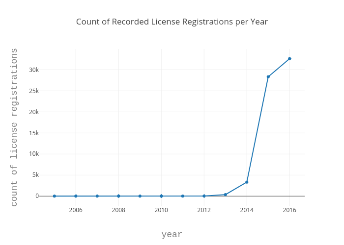
Now, I wanted to take the question a step further and refine it by looking at the count of recorded pet license registrations for each species over time because the article mentioned that the rate of cat registrations was nearly half that of dogs.
"According to numbers provided by the Seattle Animal Shelter, there are over 110,000 unlicensed dogs and nearly 150,000 unlicensed cats in Seattle. That calculates out to be a 26.9 percent compliance rate for dogs by their owners and only a 14.5 percent compliance rate for cats when it comes to licensing."
Instead of updating the plotly visual, however, I want to introduce yet another visualization tool called bokeh. Bokeh is a Python library for interactive visualization that targets web browsers for representation. It’s distinguishing feature is that it is quick and easy to create interactive plots and dashboards that you can output into various mediums such as html, jupyter notebook, or servers.
Bokeh plots rely on ColumnDataSource objects (CDS) to provide the data that is to be visualized. In the simplest form, ColumnDataSource takes a data parameter which is a dict with string column names as keys and lists of data as values. The data parameter can also be a DataFrame object, as well as a GroupBy object. When a GroupBy object is used, the CDS will have columns corresponding to the result of calling describe() on the resulting dataframe, giving us new columns with corresponding measures for mean, count, min, max, etc as the original field name with "_count" appended to the end.
With bokeh plots, you can also adjust the colors to correspond with your categories. This can be accomplished in different ways, but for my visual I use the factor_cmap() function for the fill_color in the vbar figure (a bar plot). There are many palettes available for the color mapping in bokeh; I use the palette Category20 palette.
from bokeh.models import ColumnDataSource, HoverTool
from bokeh.plotting import figure
from bokeh.transform import factor_cmap
from bokeh.palettes import Category20
output_file('groupby_year_species.html')
# cast groupings to string
df_pets.year = df_pets.year.astype(str)
df_pets.primary_breed = df_pets.primary_breed.astype(str)

# group dataframes
group = df_pets.groupby(['year', 'species'])

# pass data to ColumnDataSource
source = ColumnDataSource(group)

# setup figure
p = figure(plot_width=800, plot_height=300, title="Count Species by Year",
           x_range=group, toolbar_location=None, tools="")
p.xgrid.grid_line_color = None
p.xaxis.axis_label = "Issued licenses by year and species"
p.xaxis.major_label_orientation = 1.2

# create color mapping using Category20 palette
index_cmap = factor_cmap('year_species', palette=Category20[len(df_pets.year.unique())],
                         factors=sorted(df_pets.year.unique()), end=1)

# create bar plot, use cmap variable for fill_color param
p.vbar(x='year_species', top='license_number_count', width=1, source=source,
       line_color="white", fill_color=index_cmap,
       hover_line_color="black", hover_fill_color=index_cmap)

p.add_tools(HoverTool(tooltips=[("Count", "@license_number_count"), ("Year, Species", "@year_species")]))

save(p)
Where do all the registered animals live?
Lastly, I explore the question of where all the licensed animals are within the city of Seattle. I thought this information could be fun to know if you wanted to find other pet owners to set up pet play dates or to just know in general where the highest concentration of licensed pets are. To answer this question, I use a library called folium. Folium is a Python based library that allows the user to visualize data on an interactive leaflet map. You can customize the tileset of your map, add markers, and add a variety of layers to your map. Really neat stuff!
Anyhow, in order to answer this question, I need more data to feed the map latitude and longitude pairs corresponding to the zipcodes in our pet licenses database. Luckily, I was able to find a dataset of all US zip codes with their corresponding lat-long coordinates here. Once I read in the data to a new dataframe, I merge it with the original dataframe with the zip-code as the keys. For our folium map, we will be using Popup objects as a parameter of our Marker objects. Marker objects take in the lat-long coords as a list of [lat, long] so I create another column in the merged dataframe with these lists for each registered animal. I also filter the merged dataset to exclude null values because the markers do not accept nulls.
df_zips = pd.read_csv('data/us_zip_latlong.csv',dtype={'ZIP':str})
df_pets['zip_code'] = df_pets['zip_code'].apply(str)
# merge dataframes on zipcodes
df_merged = pd.merge(df_pets, df_zips, left_on='zip_code', right_on='ZIP', how='left')
# create column with list of [lat, long]
df_merged['lat_long'] = df_merged[['LAT', 'LNG']].values.tolist()
# filter dataframe to exclude null values
df_merged_filter = df_merged[df_merged['animal_s_name'].notnull() & df_merged['LAT'].notnull() & df_merged['LNG'].notnull()]
Now we can get into the code for the folium map! I start by instatiating the map by calling Map with my desired parameters. I set the starting location to the latitude and longitude coordinates of Seattle, my area of interest, and set the tileset to CartoDB positron. My dataset has around 65,000 names with lat-long pairs, which is quite a lot and can potentially lead to a cluttered map. Luckily, I am able to resolve this issue by adding a MarkerCluster to the map. This will group points that overlap and mark the area with a circle labeled by the number of points. When the user zooms into the area, the individual points are shown! The rest of the code is pretty self-explanatory. I iterate through the dataframe and read in the name of the animal with it's lat-long location and pass it to the marker object which is added to the marker cluster I had created. Finally, I save the map to an html on my local drive and display it in my notebook!
import folium
from folium import plugins

# Seattle 47.6062° N, 122.3321° W
folium_map = folium.Map(location=[47.6062, -122.3321], tiles="CartoDB positron", zoom_start=8)

marker_cluster = MarkerCluster().add_to(folium_map)

for index, row in df_merged_filter.iterrows():
    name = df_merged_filter['animal_s_name'][index]
    popup = folium.Popup(name, parse_html=True)
    lat_long = df_merged_filter['lat_long'][index]

    if str(name) != 'nan' and lat_long :
        folium.Marker(lat_long, popup=popup).add_to(marker_cluster)

folium_map.save('names_zipcodes.html')
folium_map
I limited the number of data points to < 1000.
Conclusion
Similar to any creative expression, everyone has their own ways of going about the process. I hope, however, that I was able to share some useful information about ways to go about creating effective data visualizations. There are a ton of different visualization tools and libraries in Python that exist. I hope that this post gives you a glimpse into the breadth of them and encourages you to explore all the options of bringing your data visions to life!
Previous post: Sufjan Stevens Lyrics Generator using a LSTM model
Next post: Still (March)ing Along...