Making a Responsive Layout with CSS Grid
One of my goals this year is to intentionally learn CSS. More specifically, I'd like to learn how to use CSS to make responsive web design, animations, and accessible websites. Recently I completed FreeCodeCamp's Responsive Web Design course and completed the first project which involves making a tribute page. I made a tribute page for Elliot Smith, which you can view here. In this project, I utilized CSS Grid and grid-template-areas to make a responsive layout. In this post, I will describe how to set up a responsive layout using my project as an example.
What is CSS Grid?
CSS is grid is a layout system available in CSS that handles columns and rows, thus making it a 2D grid system. It works by applying grid properties to the parent element AKA the Grid Container, and child elements AKA the Grid Items.
How to set up CSS Grid in your display
To set up CSS Grid in your layout, you define display on the Grid Container to set up a new grid formatting context for the contents of the container. The possible values include:
Values:
- grid – generates a block-level grid
- inline-grid – generates an inline-level grid
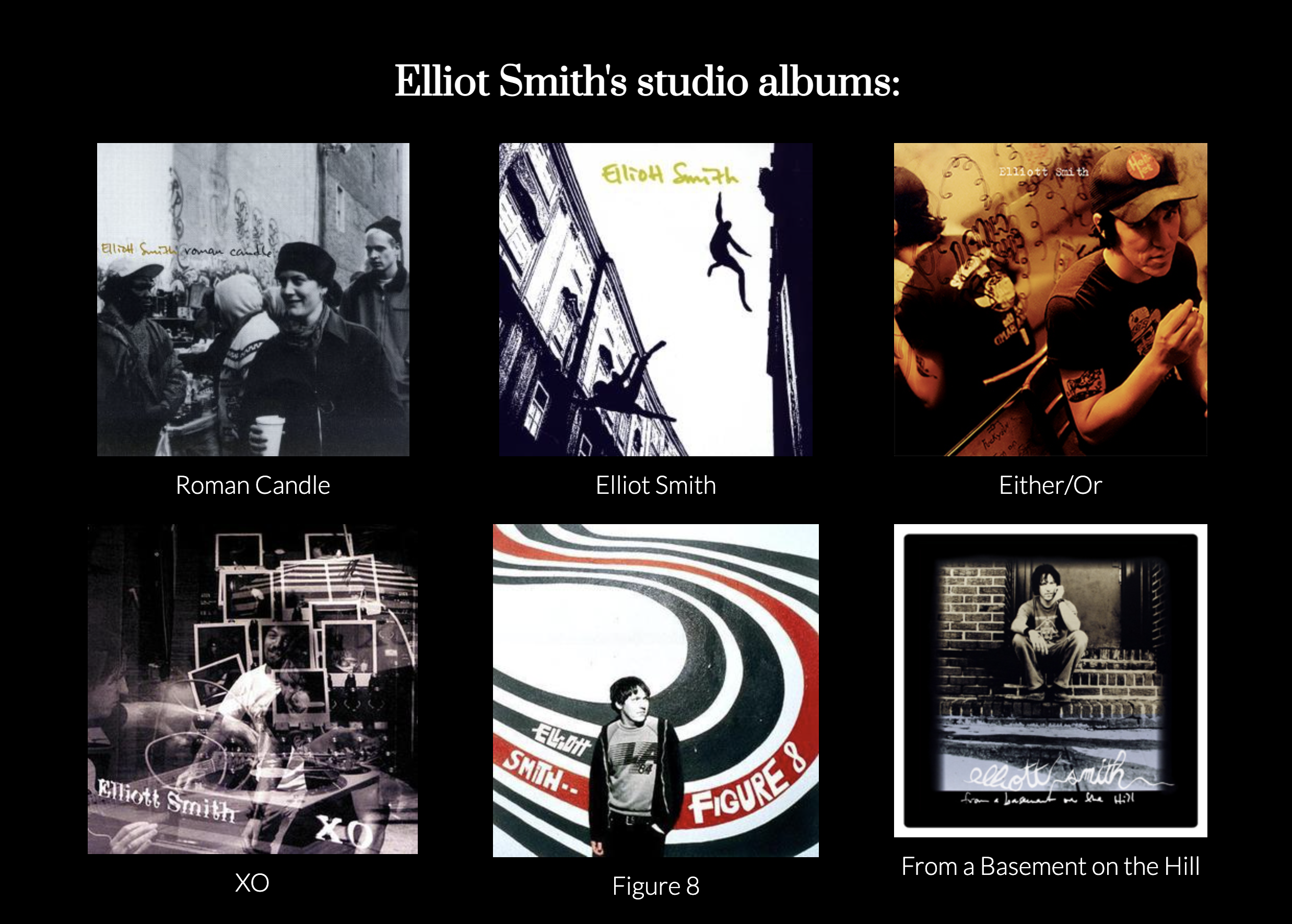
In my project, I wanted to make the album container responsive. On a desktop view, the albums display in 2 rows with 3 columns. On a mobile view, the albums display in a single column with 6 rows instead.
To begin the set up, I defined display: grid on the parent container for the albums.
.albums-grid {
  margin: auto;
  display: grid;
  ...;
}
Defining grid-template-areas
The next step is to define the layout, which I mentioned earlier. There are several ways to do this. You can define grid-template-columns, grid-template-rows, or grid-template-areas.
For my project, I went with the last option. The cool thing about grid-template-areas is the syntax provides a visual of what the grid looks like. Here is an example:
@media (max-width: 1000px) {
  .albums-grid {
    grid-template-areas:
      "album1"
      "album2"
      "album3"
      "album4"
      "album5"
      "album6";
  }
}
Resulting Layout
On a wide screen (such as desktop), the layout looks like this:
On a more narrow screen (such as mobile), the layout looks like this:

References
If you would like to learn more, here are some good references to check out.
Previous post: Year of Joy (Happy New Year!)
Next post: Sprucing up the Win Screen